Therapist Website Design: 6 Real Examples That Build Client Trust

Most people looking for a therapist are nervous, tired, or both. They will visit several websites in a row, spend less than a minute on each, and book with the practice that feels the most human. That means your website has one job: help a hurting person feel safe enough to reach out.
We design websites exclusively for therapists, counselors, and psychologists, so instead of talking theory, let’s look at six real client sites we’ve built — and the specific design choices that make each one work.
What makes therapist website design different?
Before the examples, it helps to know what we’re looking for. A strong therapy website almost always gets five things right:
- A clear niche statement above the fold. “I help adults untangle trauma” beats “Welcome to my practice” every time.
- A calm, uncluttered visual language. Soft palettes, generous whitespace, real photography — the design itself should lower a visitor’s heart rate.
- One obvious next step. Usually a “Book a consultation” button that’s visible on every screen, including mobile.
- Mobile-first layout. Most therapy searches happen on a phone, often late at night.
- Credentials that reassure without overwhelming. Licenses and modalities woven into the story, not dumped in a wall of acronyms.
Now let’s see those principles in the wild.
1. Marie Norton Counseling — somatic therapy in Richmond, VA
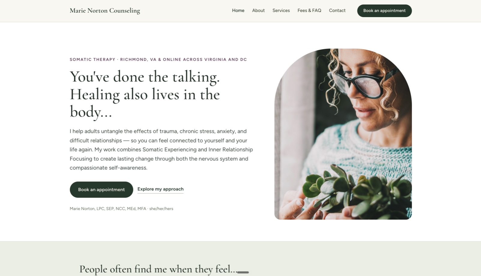
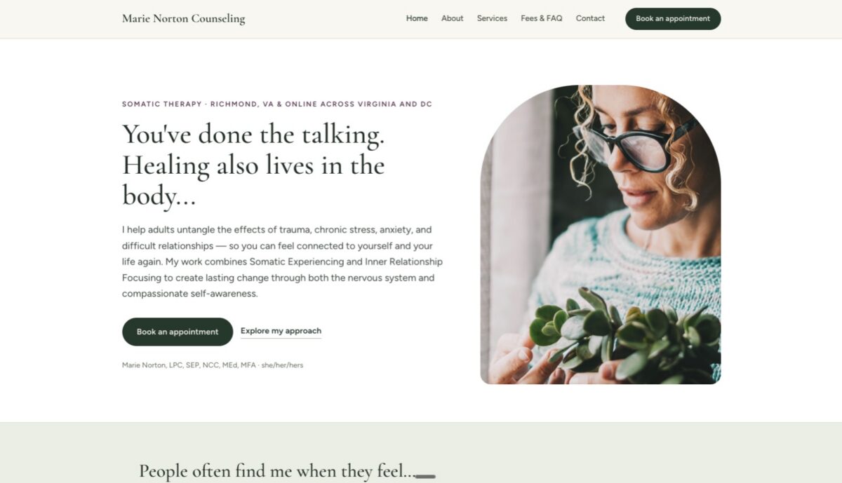
Marie’s headline — “You’ve done the talking. Healing also lives in the body.” — does more work than most entire homepages. In one sentence, a visitor knows this practice is different from standard talk therapy and knows whether it’s for them.
What to steal: a niche-specific headline written in the client’s language, warm portrait photography, and a booking button that repeats at every scroll depth.
2. Journey to Harmony — virtual therapy
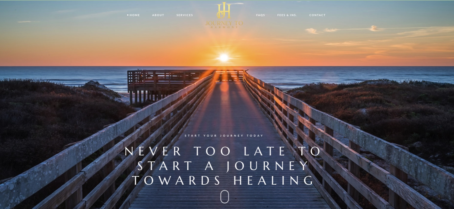
A fully virtual practice can’t lean on “conveniently located in…” — the website is the office. Journey to Harmony’s site builds trust with a distinctive monogram brand, an earthy gold-and-neutral palette, and copy that addresses the real question behind online therapy: “will this actually feel personal?”
What to steal: when you’re virtual, invest more in brand identity — a logo, consistent typography, and a color system make an online-only practice feel established.
3. Nichole Aiken Counseling — individuals, couples & families in Reston, VA
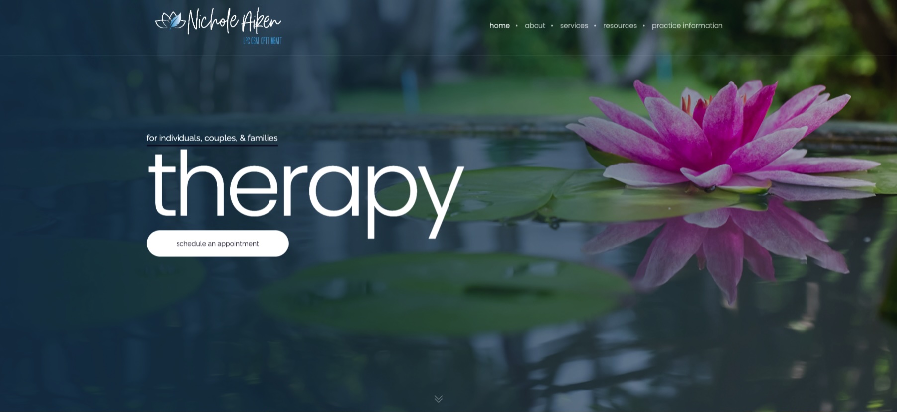
Serving individuals, couples, and families is a positioning challenge — go too broad and you sound generic. Nichole’s site solves it with clear service pathways, so each audience finds a page that speaks directly to them, plus branding (including a custom logo we designed) that ties it all together.
What to steal: separate service pages for separate audiences. It’s better for visitors and dramatically better for search rankings.
4. Breathe Easy Counseling — teens & adults in Hershey, PA
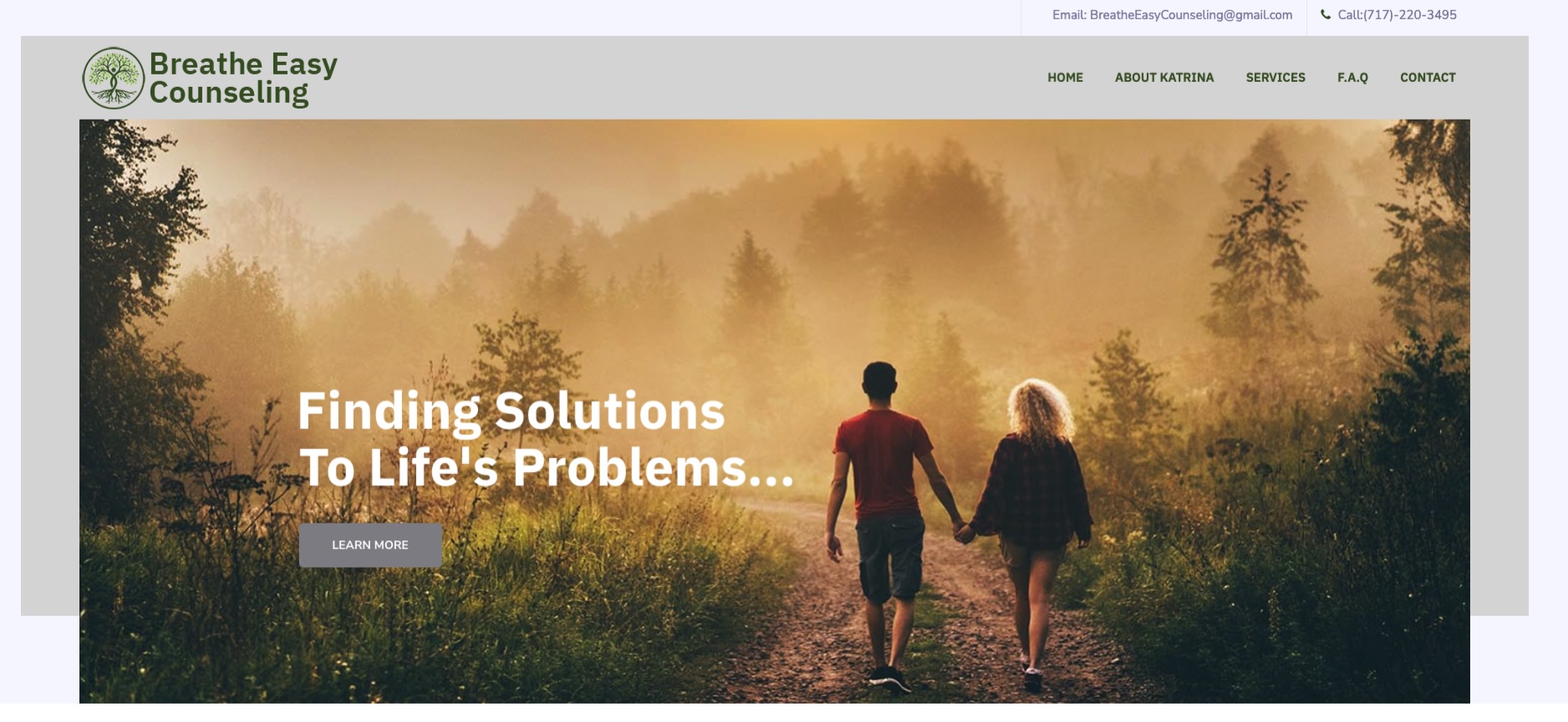
A practice that sees teens has two audiences at once: the teenager who has to not hate it, and the parent who’s actually booking. Breathe Easy’s design walks that line — approachable and unstuffy, with contact details (phone and email) one tap away on mobile.
What to steal: make your phone number a tappable link. Small detail, real bookings.
5. Rohde Psychotherapy Services — Montgomery Village, MD
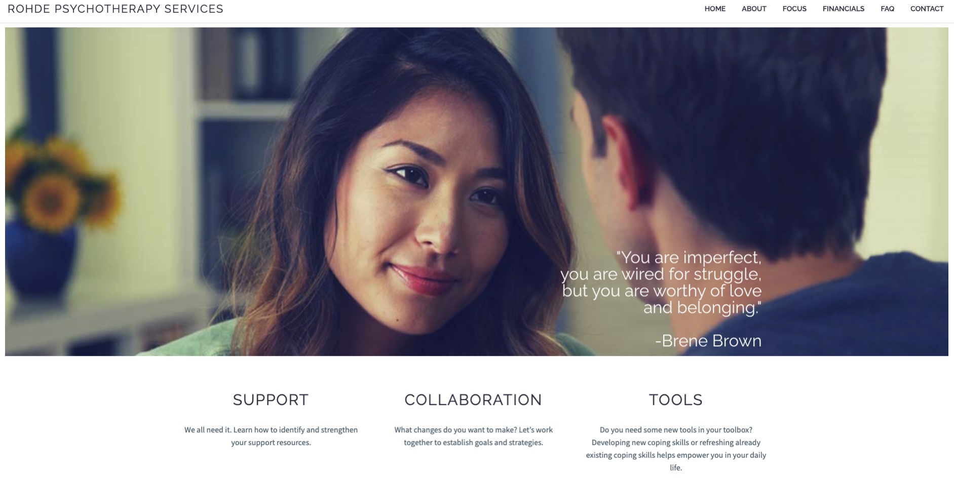
Dr. Rohde’s site shows how much a solo practice gains from simply looking current. Clean typography, a focused service list, and a straightforward path to contact — no clutter, no 2012-era sidebar, nothing between the visitor and “reach out.”
What to steal: ruthless simplicity. Every element your site doesn’t need is one less thing between a client and your inbox.
6. The Clinical Collective — forensic & clinical practice in York, PA

A forensic and clinical practice serves attorneys and agencies as well as therapy clients, so the design leans more professional: structured layout, precise service descriptions, and credentials front and center — while still feeling human rather than corporate.
What to steal: match the formality of your design to the formality of your referral sources. A trauma therapist and a forensic evaluator should not have the same website.
The common threads
Six different practices, six different personalities — but every site above shares the same bones: a niche-specific headline, a calming and distinctive visual identity, one clear call to action, and a mobile experience that was designed first rather than shrunk down last. None of them use stock-photo handshakes, walls of clinical jargon, or “Welcome to my website.”
That’s the whole formula. It isn’t magic — it’s just applied consistently, which is exactly what most therapist websites are missing.
Want a website like these?
This is all we do. We build custom, SEO-ready, mobile-first websites for therapists — and unlike many agencies, our pricing is public and you own your site outright. Browse more of our work, or get a free quote — we’ll tell you honestly what your practice needs (and what it doesn’t).